Recently,
NASA posted a pair of maps of Jupiter produced from Hubble Space Telescope
images on 2015 Jan.19, taken 10 hours (one rotation) apart, which vividly
showed the planet’s currents at high resolution:
http://hubblesite.org/newscenter/archive/releases/2015/37
Here,
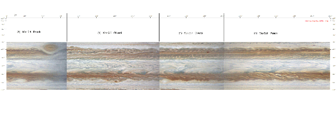
by way of comparison, we present a series of five global maps from
ground-based amateur observers, covering 2015 Feb.27 –Mar.1 and March 4-7,
plus two maps of the equatorial region. ‘Blinking’ between them
dramatically shows the planet’s jets (most obviously near the equator, but
also up to high latitudes), and shearing of disturbed regions within the major
belts, and relative motions of innumerable small spots.
The
maps are from images by Kevin Quin (USA), Damian Peach (Barbados), Tiziano
Olivetti (Thailand), and Christopher Go (Philippines), plus one image by Bruce
Macdonald (USA). Quin made his own
maps; the others were made by Marco Vedovato. All maps were made using
WinJUPOS. During this period,
observers worldwide were trying to image the planet intensively, but bad
weather affecting European observers prevented the completion of hi-res maps
covering any single rotation of the planet. The
maps have been arranged so that they follow in sequence within each longitude
sector, with intervals of one to four rotations between them (even though this
sometimes required splitting different sectors from a single rotation between
successive maps). The 5 global
maps are in System II longitude with south up. Major
spots are labelled on the first two of them. The maps are presented here in an
animated GIF but the original (larger) maps can be provided if required.
Also,
we present two composite maps of the equatorial region, from the same image
sequences, in System I longitude with south up.
In three sectors, the maps are one rotation apart, so they show
small-scale motions within the great equatorial jet-stream; in the fourth
sector, the maps are four rotations apart.
The large dark formations on NEBs are stationary in this longitude
system, but note the faster (leftward) flow of the SEBn, and the slower
(rightward) flow on the equator. Small-scale
features of interest include:
--A
series of closely spaced waves on the equator at L1 ~ 110-130, moving with the
slow equatorial flow;
--Complex
motions in and around some of the NEBs dark formations, including possible
anticlockwise flow of streaks in the EZ on the Sp. edge of formations near L1
~ 240 and 295;
--Possible
faster (leftward) motion of a bright streak on the NEBs edge at L1 ~ 15, but
no widespread faster motion at this latitude.
(Apparent shift of a small, very bright spot at L1 = 129 is more likely
due to multiple short-lived clouds, as images before and after (by M. Kardasis
and P. Edwards) show no continuing motion.)
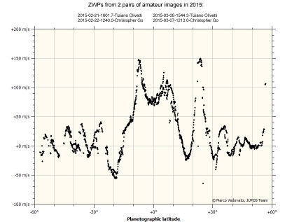
Whereas the animated maps are simply a visual display of the planet’s winds, the same data can be used to measure the zonal wind profile. Marco Vedovato has done this with two pairs of images, on Feb.21-22 and on March 6-7: each pair were taken by Olivetti and by Go, 20 hours apart. His ZWP is shown here (plotted as wind speed in System III). The two fastest jets are the NTBs jet, 148 (±1) m/s, and the SEBn jet, 146 (±1) m/s.
CLICK IMAGES BELOW FOR
ANIMATIONS AND/OR LARGER IMAGES.


