- This topic has 11 replies, 8 voices, and was last updated 5 years, 8 months ago by
 Dr Andrew Smith.
-
AuthorPosts
-
6 August 2020 at 9:37 pm #574693
 Steve HarveyParticipant
if anybody would like to submit a suitable image for the cover image of the 100th edition of the BAA Handbook, then please get in contact.
Cheers
Steve6 August 2020 at 10:00 pm #582980 Richard MilesParticipant
Yes – I would like to echo Steve’s appeal for an image that might potentially grace the cover of this the 100th edition of the Handbook. As with the Journal, we are looking for something notable. It’s usually in square format if that helps and should not have any person in the picture and preferably be in colour although this is not essential. The theme is often one involving objects in the solar system so one showing two solar system objects in the same view would be good – how about a photogenic lunar occultation of a planet?
7 August 2020 at 8:52 am #582981 Peter AndersonParticipant
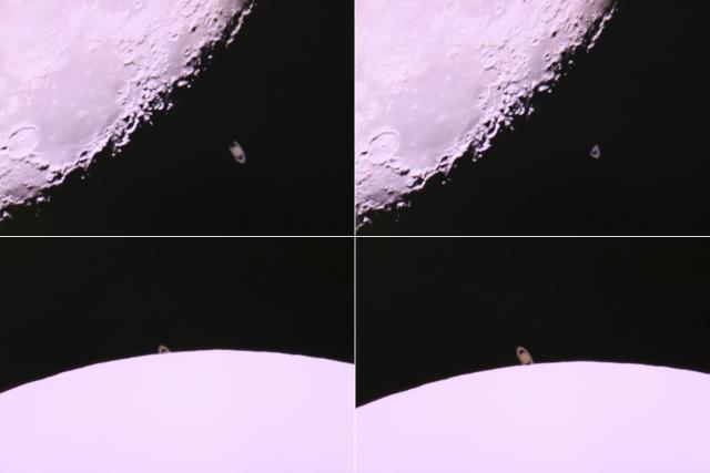
I thought I should answer the call with four images to show the progress of the occultation of Saturn on 12th August 2019. (taken with a C14.) I have literally dozens in the series, but the more that are included, the smaller each becomes, and if we resort to cropping, then the effect is lost. I am not particularly hopeful, but if the images look interesting, I can supply futher details
 13 August 2020 at 7:35 am #582998
 Peter AndersonParticipant
I have added captions to the images
13 August 2020 at 12:38 pm #583001 Peter Goodhew FRASParticipant
Here’s another offering showing the moon every 2 minutes until occultation
14 August 2020 at 4:50 pm #583004 Richard MilesParticipant
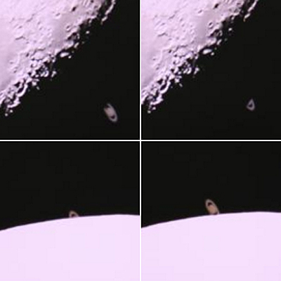
Peter – Thanks for the Lunar Occultation of Saturn images.
The finished set of 4 need to be almost square so I suggest each image also be formatted square.
Something like the appended so that Saturn can be seen at a higher image scale. Have to avoid pixelation so may mean saving at even higher pixel resolution. Details of observer and instrument would go on the inside front cover. But it would make sense to put the UT times in the front cover quadrants.
 15 August 2020 at 9:53 am #583006
 Peter AndersonParticipant
I would be happy to make adjustments if my images were to be selected, but there will doubtless be other worthy contenders.
16 August 2020 at 2:57 am #583008 Peter AndersonParticipant
I have made the adjustments. I am also placing it on my member’s site (in more detail.) I have versions with and without text.
16 August 2020 at 4:41 pm #583010Roger Dymock
ParticipantHi Steve,
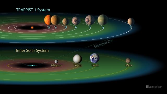
I think the attached image fits the bill as it shows several Solar System objects plus another (extra) Solar System!!!.
Regards
 16 August 2020 at 9:20 pm #583012
Neil Morrison
ParticipantJust a thought Perhaps we need to be more imaginative and have a cover that encompasses as many of the Sections as possible. ie Variable Stars, Solar System Planets, Comets, Meteor, Aurorae, Radio, Instruments. Historic. A montage .
Regards
Neil
17 August 2020 at 9:30 am #583014 Daryl DobbsParticipant
I agree with Neil, a montage from the observing sections would be very fitting for the 100th edition, not sure if there would be room for all of them or the sections which no longer function like star colours.
17 August 2020 at 10:16 am #583015 Dr Andrew SmithParticipant
How about a montage starting with visual drawn observation through photography/ ccd or cmos to spectra and photometry.
This would illustrate the progression over the period.
Regards Andrew
-
AuthorPosts
- You must be logged in to reply to this topic.
